Yesterday (by mistake) I upgraded a RUTX11 to Firmware 7.6 via the normal System → Firmware page. I guess it’s showing up early, because it hasn’t been published yet at RUTX11 Firmware Downloads - Teltonika Networks Wiki
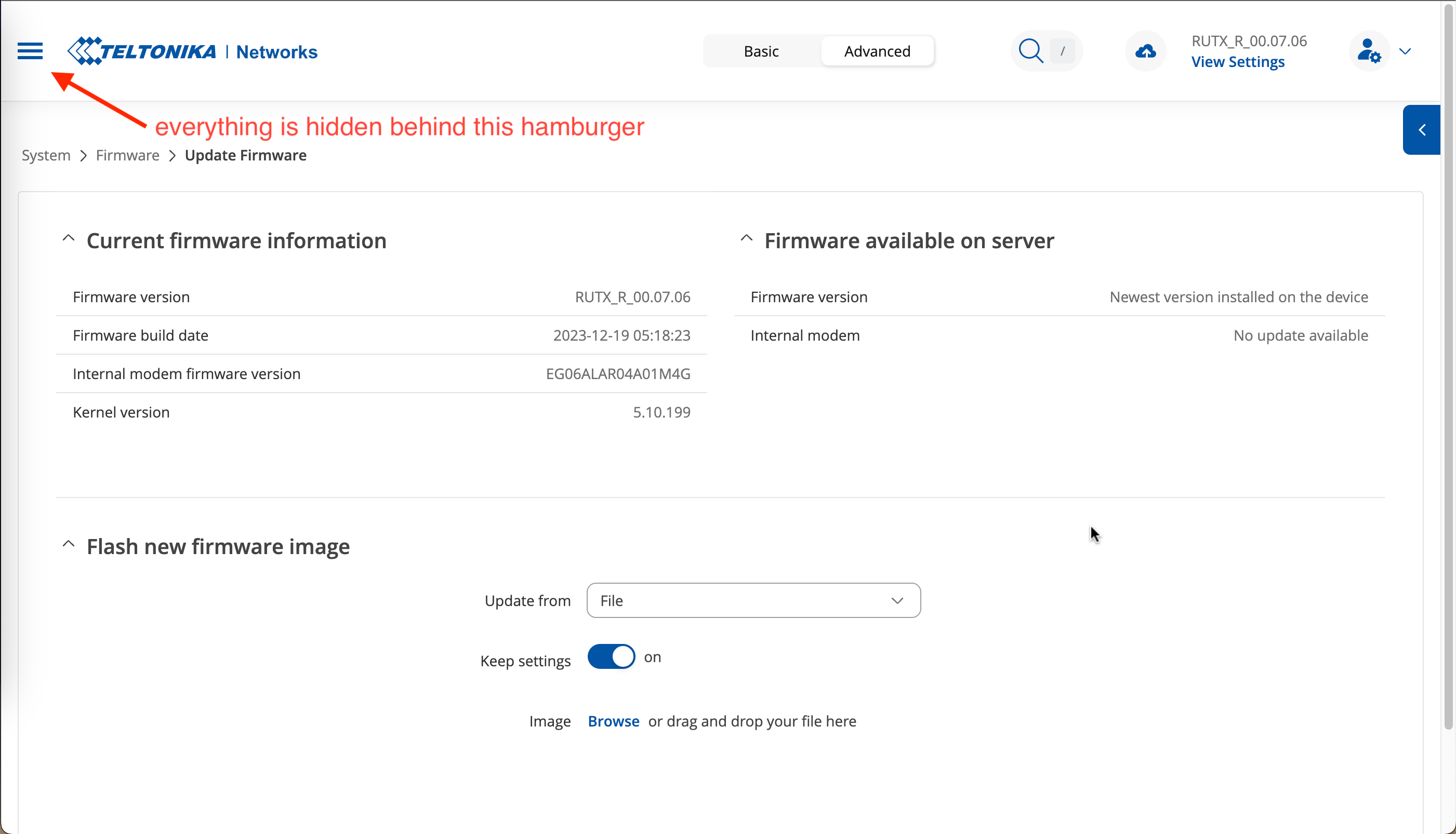
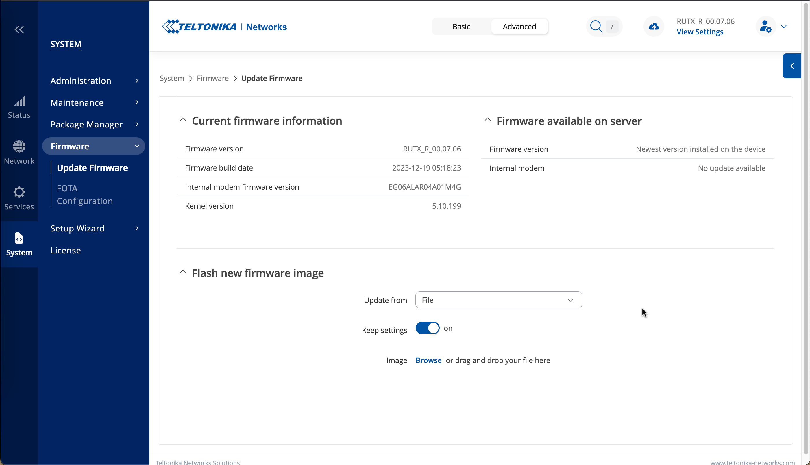
In any case, when I logged back in, the screen was in a weird “mobile” style view where the side navigation was collapsed and has to be re-opened after each click. Very inconvenient on a desktop/laptop computer. I finally figured out that it’s just a “responsive” web view, and if I shrink my browser zoom level to 90%, it goes back to the expected view.
After consulting with the R&D team, it appears that this behavior is intentional. The design has been updated for smaller screens, and it functions as intended for your screen size. The menu should become visible for screens with a width of 1401 pixels or larger.
I would suggest using 90% view if you want to see the menu all the time. I’ve also shared your feedback with the RnD team, suggesting that it may not be convenient for some users.
@AndzejJ I think I have a fairly common screen size for a laptop (this is very standard Mac laptop) and I would imagine it would be frustrating for many users to always have to remember to zoom out those screens.
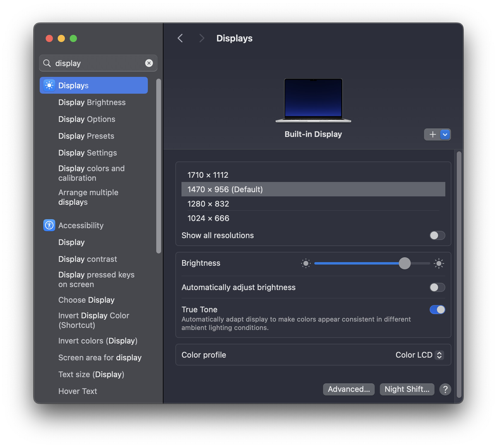
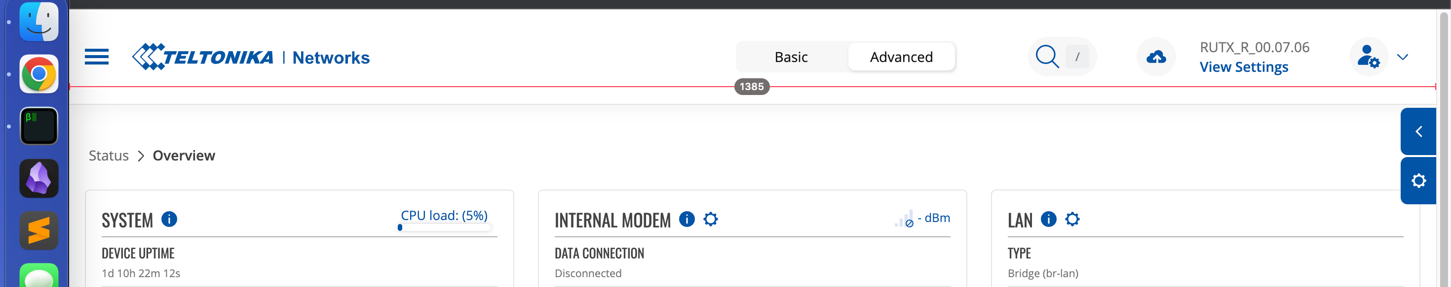
Thanks for the info that <1400px the navigation menu gets hidden. I realized that with the macOS “Dock” taking up approximately 80px on the left side, it was making my browser window 1385w. I “solved” this by shrinking the size of dock a bit (now I have to squint at it) but I would urge R&D to consider making the threshold a little tighter, maybe ~1350px to avoid this behavior that I would imagine a large number of users may encounter.
Since this topic will auto-close in a few days, I just want to leave a final comment that I still hope this change is refined in future versions to make it more accessible for devices with lower resolution. Even a simple toggle switch in LuCI to turn off the responsive UI would be fine.
I have received information that the RnD team has decided to make changes in the future firmware releases. Currently, there are no details regarding what exactly will be changed. However, in your specific case, this issue will be resolved.